
RAW edit challenge
These are some of my favourite from the over 1000 images on my recent edit my RAW files challenge. Thanks so much to everyone who entered. If yours isn’t below then please feel free to share it on Instagram story or post, Facebook or Twitter. Tag me if you want me to see it and share it and use #2020NDEDIT so everyone can see them. I have put my favourite three at the start of each section
(note - I have also copied the notes that the editor gave where available and linked to Instagram profile)
If you want to have a go at editing the RAW images you can download them here.
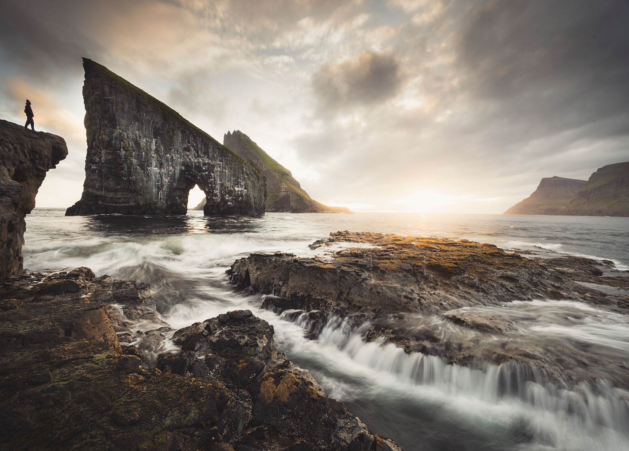
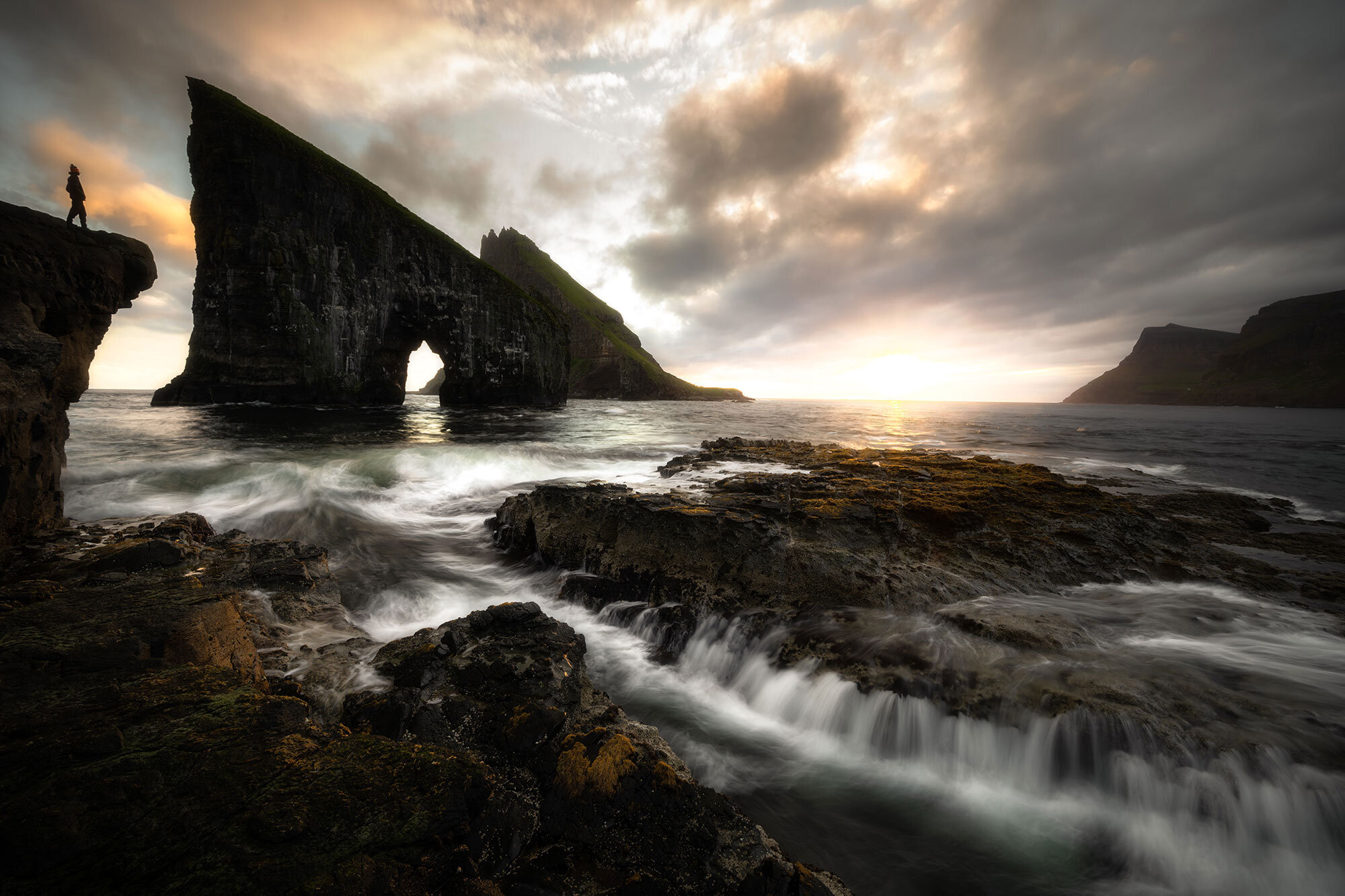
The Faroes

Santiago Nleto Gallego
I was thinking to crop the picture but I saw you did that on your feed so I decided to keep the whole picture. I hope you like it! :-)

Nicola Lazzarini

Felix Schumacher

Oriol Pareras

Jeremy Davis

Alessandro Zompanti
Tomáš Šarišsky
Ryan Raymond
I enjoyed editing this image and found the sun a bit of a challenge, it was either to blown out or it was showing to much halo, but I think I got it in the end. I also wanted to emphasise the flowing water and make it stand out just a wee bit so I highlighted the flow of the water using the paint brush in lightroom and taking the exposure and whites up just a fraction. I also adjusted some levels in the HSL using Saturation, Luminance and HUE, but very very slight, less is more I think. I also used split toning to warm the highlights and shadows, again only very slightly. Cropped the image just slightly also. I also gave the image a slight vignette to draw the eye into the centre of the image but not a huge amount.
I also used a grad filter to take the sky exposure down slightly then using the luminance slider in the range mask so it didn't affect the rock on the left hand side.
As I was wanting to keep the detail of the overall image but soften it down I took it into Photoshop and used a gaussian blur and adjusted the levels, then took the opacity down, this gave the image a softer feel yet kept it's integrity and details in the rocks.
Overall I am pretty happy with this edit and I am really not one for over doing my images, I hate over processed images and I feel what I have done has complemented the image quite nicely and pleased with the results. I hope you like the edit and thank you so much for giving everyone the opportunity to edit one of your images and it will be interesting to see how others do their edits, I find it fascinating that we all see things in different ways, a person will see one image in a completely different way to another person and what they like maybe what that other person doesn't like, it's a bit like life in general really, that's why us as humans are all very unique.
https://www.instagram.com/ryanraymondphotography/

Matt Savage
I used lightroom for little tweaks and then Affinity Photo for adding some more soft light for the sun. I hope you enjoy it as much as i did to edit the photo!
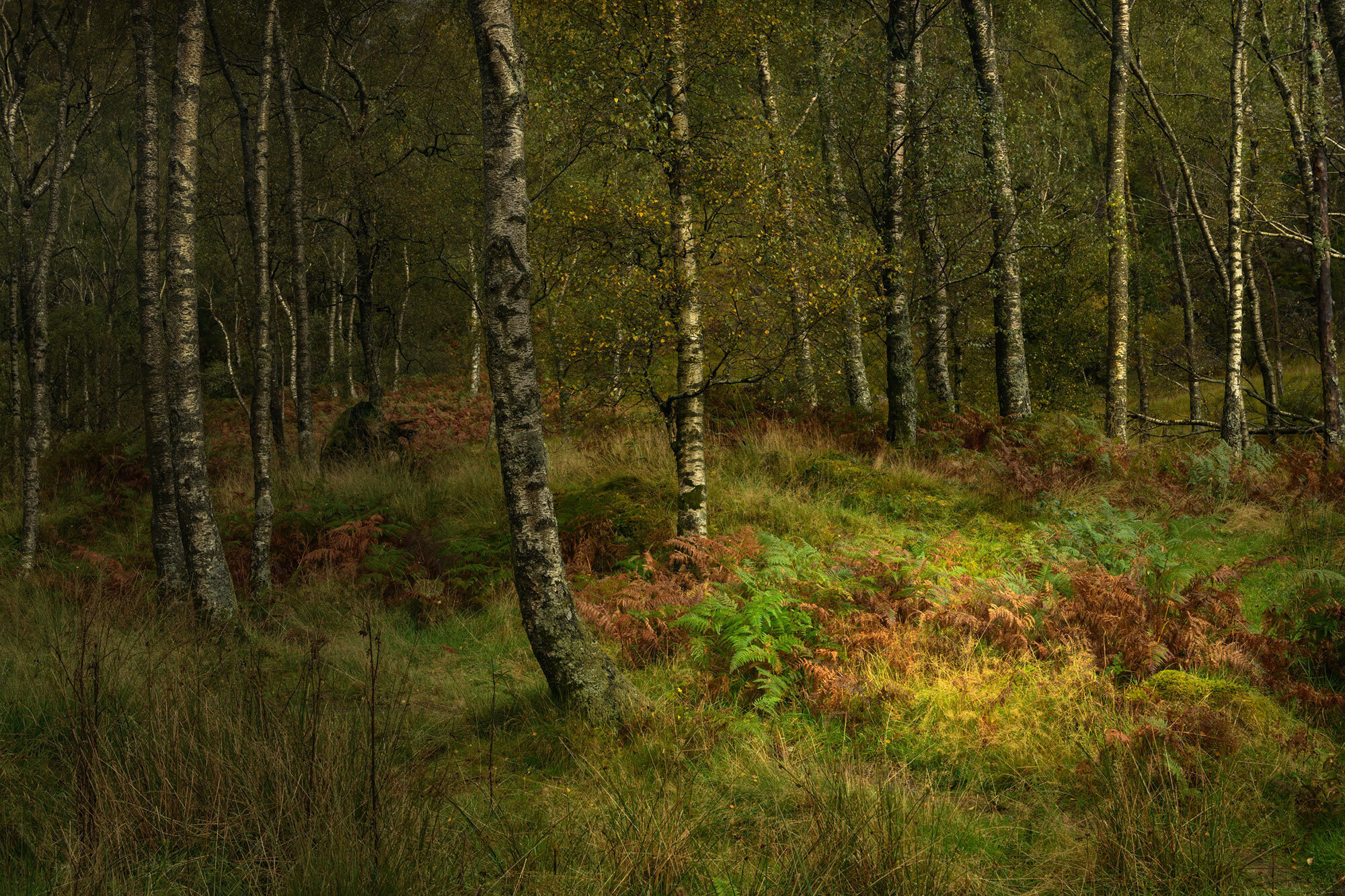
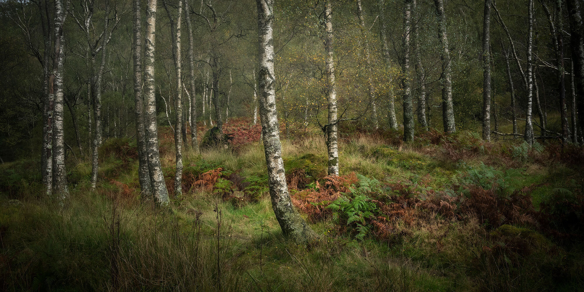
Autumn Silver birch, Lake District

Kev Bell
The aim of the edit was to achieve a low key toned B&W image by dodging and burning through hard and soft selections/masks.

Manuel Palacios
That was a beautiful file. This is a great exercise and thanks for sharing!

Daniel Spergel
I was going for a soft, painting like look with the forest, trying to bring out the peace and quite of the scene.
Frank Balde

Mario Valkenborg
I tried to create depth and have a nice centerpiece with more to explore afterwards.
The most post-processing was in Lightroom ..... trying not to go overboard .... in Photoshop i worked with layers, dodging and burning and local contrast.

Michael Johnston
I've pushed the editing more than I would normally, probably too far. I'm not used to such pliable files!

Tjaard Pijning
Darrell Jobin
All done in camera raw and photoshop.

Robert Schlomann
The interest that pulls the viewer into the image is the depth of the trees; the contrasting texture of the bark and the grass keeps them there. Cropping it to remove the sky simplifies the visual elements to grass, ferns and trees. There are nice colors, but there's a quality in the B&W version that adds an element of mystery for me. The sharpening is borderline "crunchy," but much of the subject matter is the texture in the bark, and the softness in the grasses that I think it still works. Would love to know if I'm missing what you see in though.
This was interesting to try. I'm looking forward to what you compile from it. Thanks for doing this!

Steve Bennett
It's a little strange editing without the memory of being there. I have a memory of a similar woodland but it was cold, damp and more overcast which I think is reflected in this edit. Reality it isn't but it was fun to do.

Ian Whiting
ACR: crop, radial filter for vignette and warm the centre spot. Add some texture and clarity to floor. Brush two lighter paths through trees to centre for leading lines. Grad filter at base to darken.
Photoshop: 8-bit mode, lighting effects to create sunlight shaft and darken ambient. Curves to add more red to centre floor.
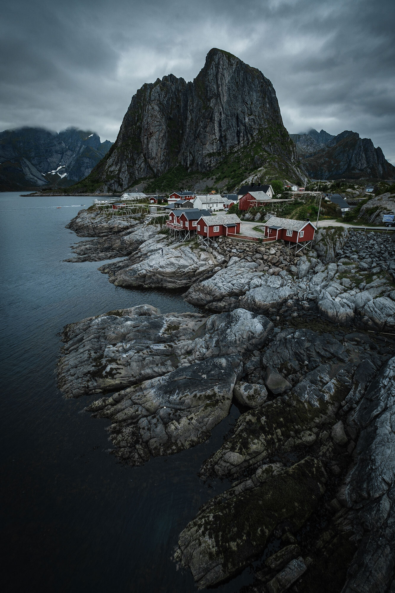
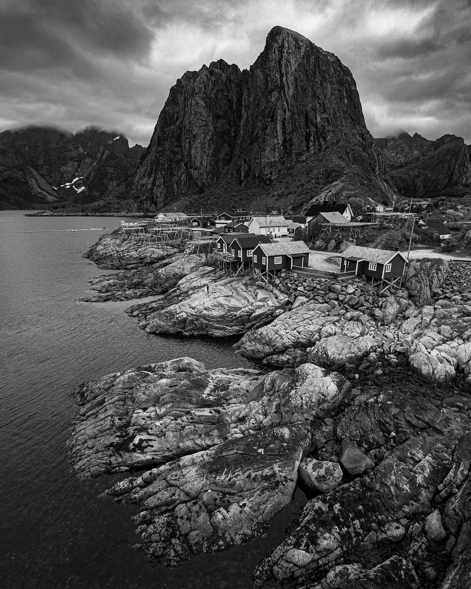
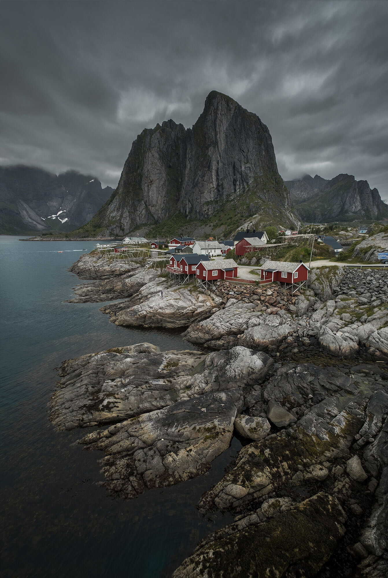
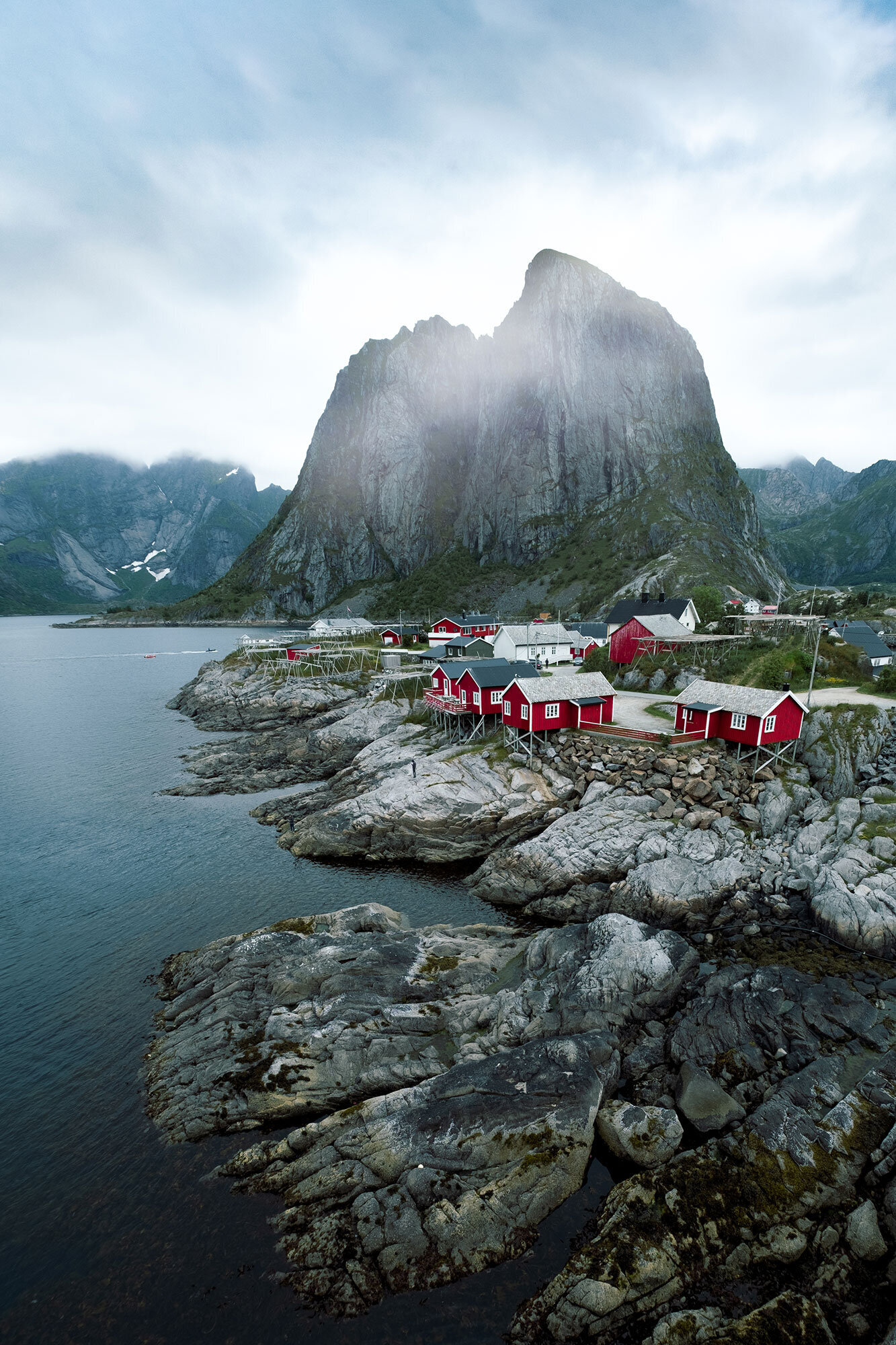
Lofoten

Haylee Maxwell
Love your landscapes and it’s super inspiring to me! This is what I hope to branch out to and I appreciate your channel so much.

Ruben Beijl
I challenged myself to edit on my phone via Lightroom mobile. Keeping the workflow minimal and quick. I really enjoyed editing a photo that was so well exposed. Hope you don’t think I ruined it. Greetings from the Netherlands! Ruben

Arjan Kemeling
I felt like creating a misty ,toned down atmosphere with clouds rolling over the mountains in the back, mist at the foot of the cliffs and enveloping the red houses... the foreground is more clear and a bit darker. I cropped the image slightly to use the leading lines of the water to guide your eyes to the red houses. And I added some "highlights" on the lighter parts of the cliff behind the houses. The high contrast between the shadow and the highlights of the rocks accentuates the massiveness and awe that one would have when visiting this place.

Emilian Primov

Gabriele Nunnari
I know lot of people are against very strong retouch, but I like to have photos a bit more punchy and I felt that this sky and some sunrays would have make it look better (for my personal taste).
Stefano Maccarana

Niall Mooney
Your original image is stunning. With the edit, I wanted to try and show the contrast of the cold, bleakness of the environment with the warm tones of the village buildings, pulling most of the Greens and Yellows, and using the lighter areas of the image to drawing your eye right up to the mountain top.

Robert Platt
I think this is a brooding moody image. The black mountain looms over the small houses like something from a scene in Lord of the Rings, while a threatening storm fills the background. A dark Black and White with high contrast seemed to be the right way to process it.
Enrico Viappiani
Pablo Barrio Seco
Thank you for giving us the opportunity to edit one of your photos. In my edit i just try to focus the attention the red houses a bit more giving the whole picture that cold and kind of blue feeling. I also add a bit of fog covering the mountain, because i want the red houses to be the main thing in the picture. Apart from that, i crop the image a little bit and i extend a bit the sky.